Meow or Never
How user data corrected heuristics for a non-profit.
Project Overview
"It's Meow or Never" (IMON) is a non-profit cat rescue with a website that, based on an initial heuristic review, appeared to have significant usability flaws.
This project documents my process of starting with a strong, biased hypothesis, testing that hypothesis against real user data, and ultimately pivoting to a set of recommendations that were far more targeted, effective, and achievable for a non-profit client. It serves as a personal case study in research humility and the power of data to correct assumptions.
My Background
My girlfriend and I adopted our cat, Fawn, from IMON in 2024. I was initially drawn to the organization because of their mission and impact, but as a UX professional, I couldn't help but notice the usability issues on their website.
Wanting to help, I offered to conduct a UX review and provide recommendations. This personal connection added motivation but also introduced bias, as I was eager to "fix" the site based on my own design preferences.
We are so happy with Fawn and grateful to IMON for their work, which made me want to give back in my own way.
My Role & Methods
As a UX Researcher, I conducted the end-to-end research process. The goal was to identify and validate usability issues to provide actionable recommendations. Being user-centered meant looking past my own design preferences to find what actually helped the users (and the cats).
The methods were chosen sequentially to first generate a baseline and then systematically challenge it.
- Heuristic Evaluation: I started here to quickly identify obvious usability problems based on established design principles. This formed my initial hypothesis.
- User Survey (N=13): Deployed to gather broad quantitative and qualitative data from real users to see if their sentiments matched my expert review.
- Usability Testing: Conducted to get observational data. Seeing what users do is the ultimate test of any hypothesis, and in this case, it provided the clearest evidence for a pivot.
The Initial Hypothesis
Based on my heuristic evaluation, I hypothesized that the website required a comprehensive redesign. My review identified several usability issues:
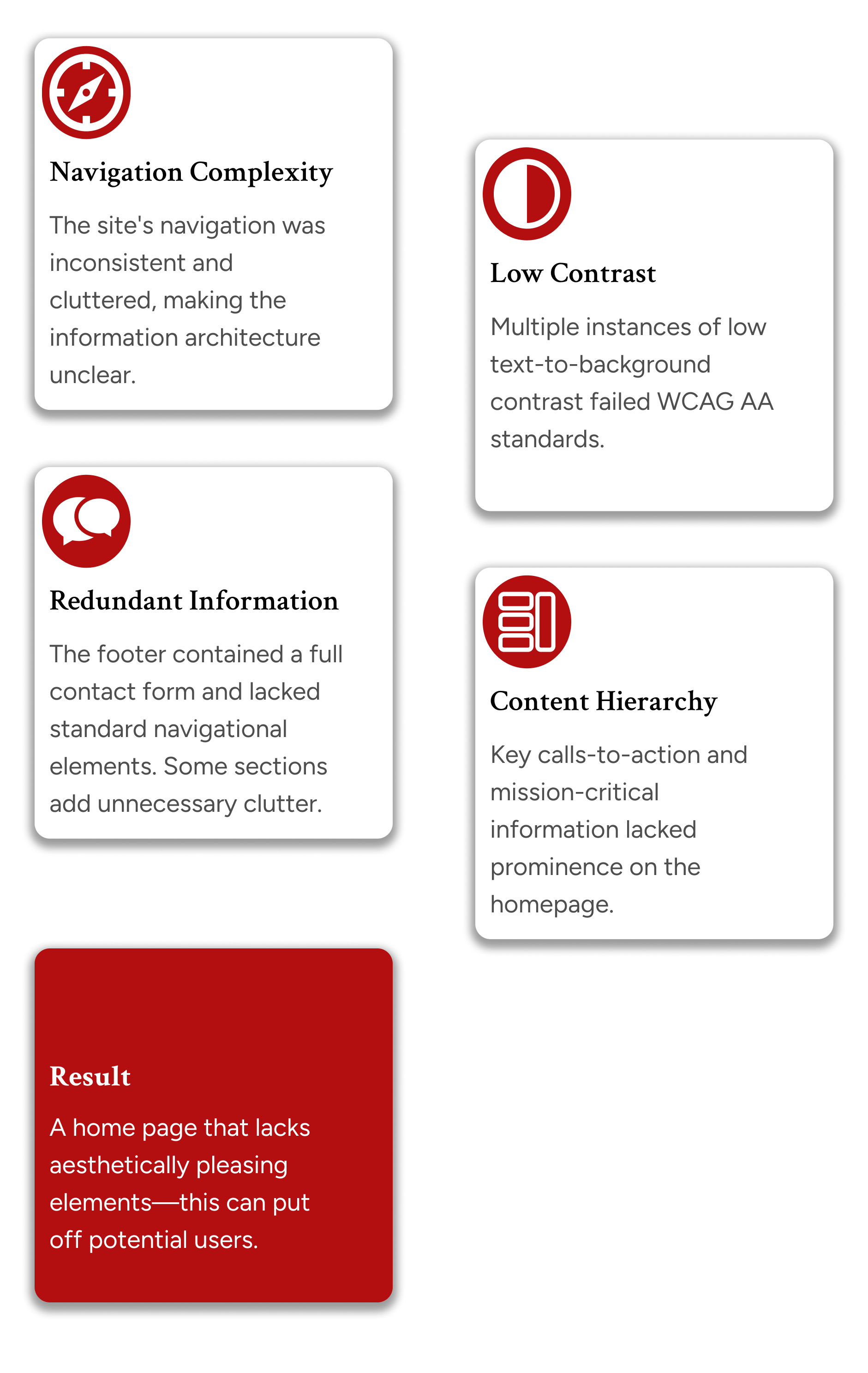
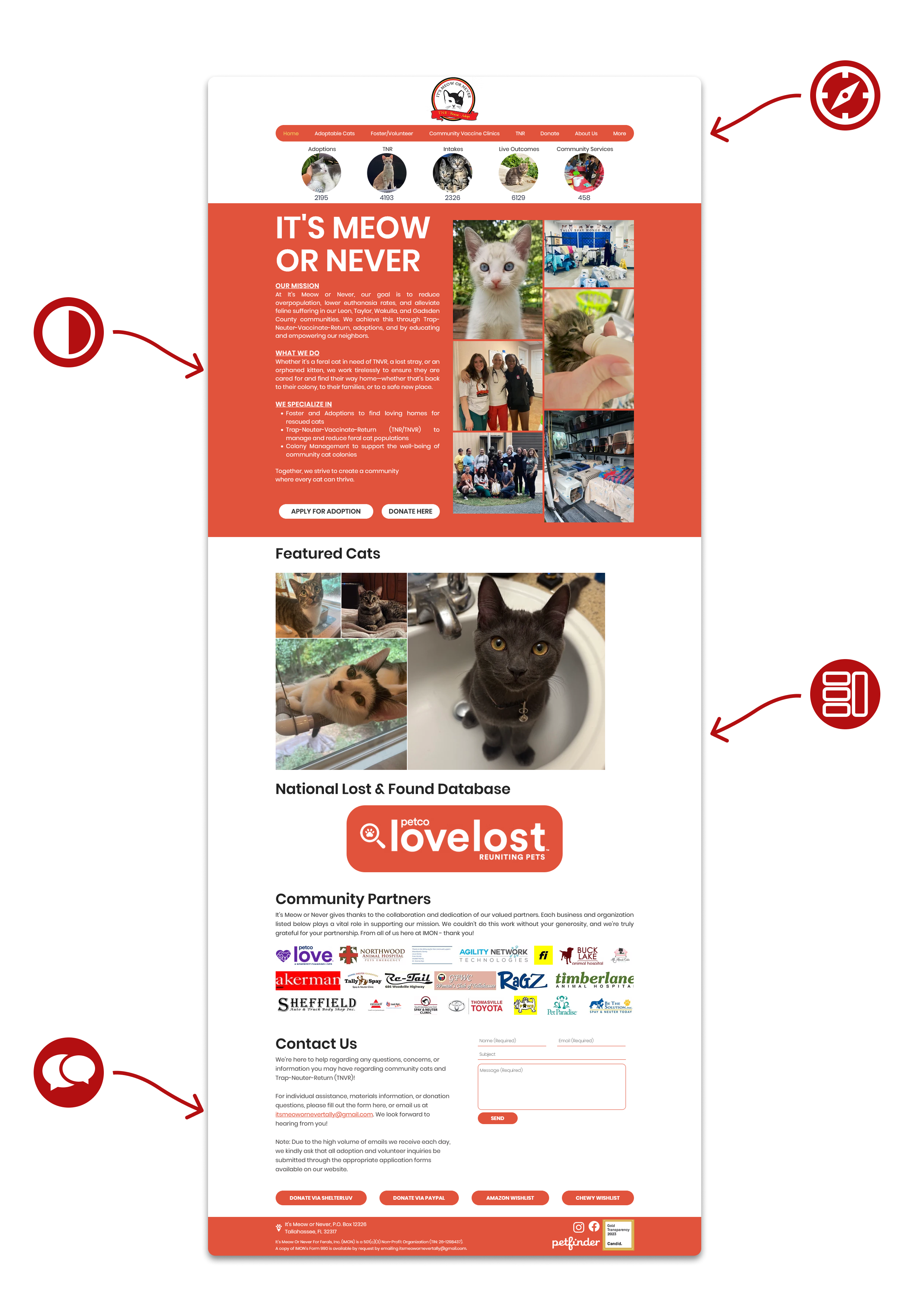
My bias as a designer-minded researcher led me to believe that these aesthetic and heuristic flaws would automatically translate to a poor user experience and deter users.
The website's aesthetics, hierarchy, and accessibility flaws create a frustrating user experience that is the primary barrier to adoption and donations.
Challenging My Assumptions with Research
User Survey
The survey results provided the first wave of data that directly contradicted my assumptions.
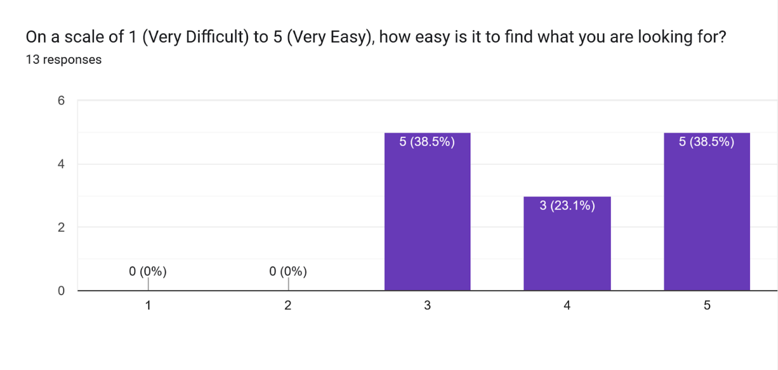
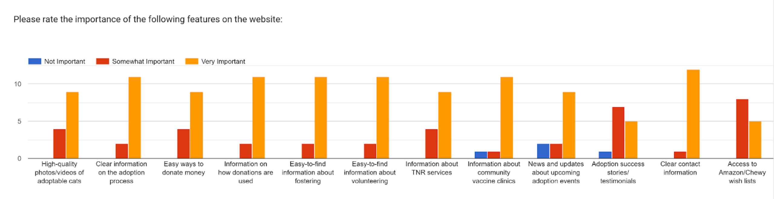
- Navigation Was Not the Problem: 38% of respondents gave the website a perfect 5/5 score on "how easy it is to find what you're looking for." The overall sentiment was positive.
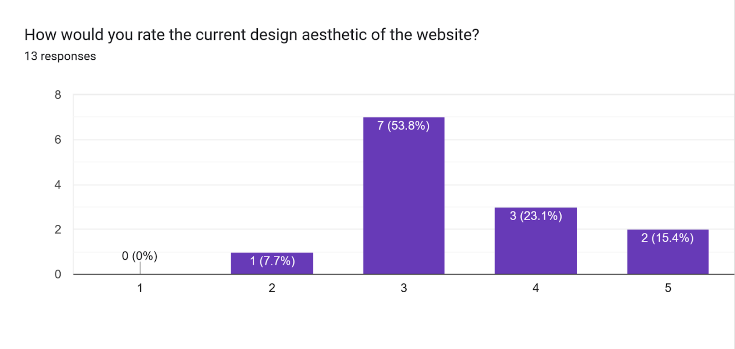
- Aesthetics Were "Just Okay," Not a Blocker: 54% of respondents gave the site a 3/5 aesthetic rating. This told me that while it wasn't winning awards, it wasn't the critical barrier I assumed it was.
- Content Priorities Were Clear: Users cared most about "how the adoption process works" and "clear contact information," not the news and events I had focused on.
Usability Testing
I then conducted usability tests, asking participants to complete key tasks. This observational data was the final piece of the puzzle.
- High Task Success & Efficiency: Participants completed core tasks like "find a cat to adopt" and "donate" in less than 10 seconds. My perceived navigation and hierarchy flaws were not impeding users in practice.
- The most consistent complaint was friction and confusion related to the "Shelterluv" third-party integration used for adoptions and donations. The usability break was not on the IMON site itself, but in the handoff to this external tool.

The Learning & Revised Recommendations
This research was a valuable lesson in humility and the power of challenging my own assumptions. My heuristic evaluation was a starting point, but it was not a substitute for real user data.
Instead of an unnecessary redesign, I pivoted to a set of targeted, data-driven recommendations that would address actual user needs and be far more achievable for a non-profit.
My Final Recommendations
- Address Accessibility First: Remove the red background that causes poor contrast. Change the red color used for text and links to a shade that meets WCAG AA standards. This is a high-impact, low-effort fix. I suggested #B30F11 as it meets contrast requirements while maintaining brand color.
- Optimize the Homepage:
- Remove the "Lost & Found" database link to reduce clutter.
- Break up large blocks of text to improve scannability. This is key.
- Clarify the Adoption Process: Create a new, dedicated page that explains the adoption process step-by-step, directly addressing the #1 piece of information users wanted.
- Investigate the Shelterluv Integration:
- Add "what to expect" text before users click out to the platform to smooth the transition.
- Research if Shelterluv offers different, more seamless integration methods.
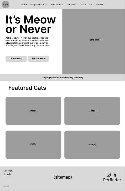
A Quick Redesign
To help visualize the impact of these recommendations, I created a quick redesign prototype focusing on the homepage and adoption flow, while implementing aesthetic and accessibility improvements.
I started with a cleaner, more modern layout that prioritized key user needs identified in the research.
I then fed that into Figma Make to create a high-fidelity mockup. Below is a video walkthrough of the interactive prototype.
After this video was captured, I refined the prototype further based on feedback from peers and stakeholders. IMON wanted me to change the red color to a darker shade for better readability, so I updated it to #B30F11.
Reflection
As of the time of writing, IMON has not yet implemented these recommendations. However, the research process itself was invaluable to me.
As a researcher, it's crucial to acknowledge when your hypothesis is wrong. This project was a perfect example. By trusting the user data over my own opinion, I was able to move from a costly, unnecessary redesign proposal to a set of simple, high-impact recommendations that directly address documented user needs.
This approach not only provides more value to the stakeholder but also demonstrates a key research skill: the ability to listen, learn, and pivot.