Sleeper Mobile
Redesigning the messaging architecture to restore the platform's core social promise.
Project Overview
Sleeper positions itself as a social-first fantasy platform, aiming to be a 'digital playground' where friends connect over sports. While this social focus is its main differentiator, the actual mechanics of communication, specifically direct messaging and league chats, have become increasingly difficult to navigate amidst growing feature density.
This study performs a deep-dive analysis of Sleeper's messaging architecture. By identifying the gap between what users want to do and what the interface allows them to do, I aim to propose a redesigned social flow that restores the app's core promise of connection.
My Background In Fantasy Sports
I've played fantasy football for over a decade and have been the commissioner of my childhood league for almost just as long. Two seasons ago, I convinced my league to migrate from ESPN to Sleeper because I wanted to test out specific features that ESPN lacked.
Sleeper felt new and exciting, whereas ESPN had become stale and outdated.
As an active commissioner who likes testing new rules every season, I needed a platform that offered deep customization. As a frequent user, I want the app to be the best it can be.
Phase 1: Discovery
I conducted a "triangulation" of data sources to define the problem. This involved social listening to validate market sentiment, heuristic evaluation to audit the interface, and proto-persona development to target the right users before I started usability testing.
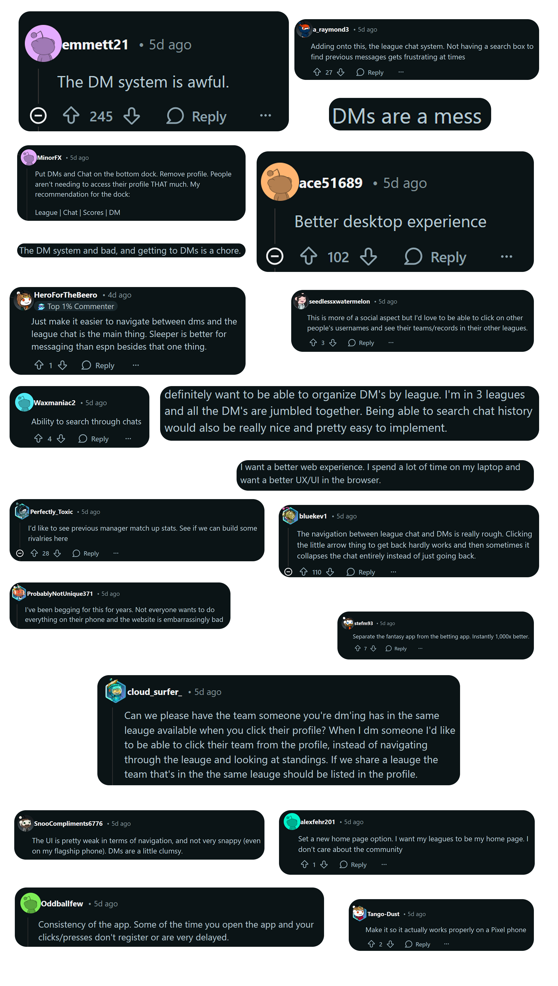
1. Social Listening
I utilized social listening on the r/SleeperApp subreddit. The goal was to move beyond my own bias and see if the issues I felt were a widespread sentiment.
To do this, I created a post asking users about what they'd change, add, or remove from the app. Over 150 comments later, it was clear what the primary pain points were.
Many users expressed frustration with the messaging system, citing issues like cluttered UI and difficulty finding conversations.
2. Sentiment Analysis
I then performed a sentiment analysis to quantify broader user sentiment.
Reddit allows users to add '.json' to the end of any thread URL to access its raw data. I scraped 8 posts (including my own) containing plenty of user comments by copying the JSON data into a text file.
I then wrote a Python script utilizing the VADER sentiment analysis library to analyze the comments and generate a sentiment score.
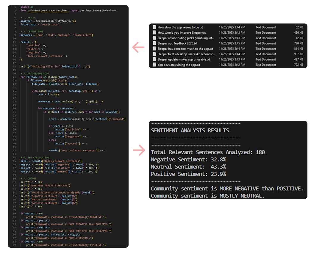
My keywords were relating to DMs as that was the focal point of my testing. The results showed a substantial negative sentiment towards the messaging system, validating my initial hypothesis.
There was a large volume of "neutral" comments, likely from users stating facts or asking questions without expressing sentiment.
3. Heuristic Evaluation
I audited the mobile app using Nielsen’s 10 Usability Heuristics. This identified specific violations that could be tested in usability sessions.
If these screens were found to be problematic during testing, I could begin to consider design solutions.
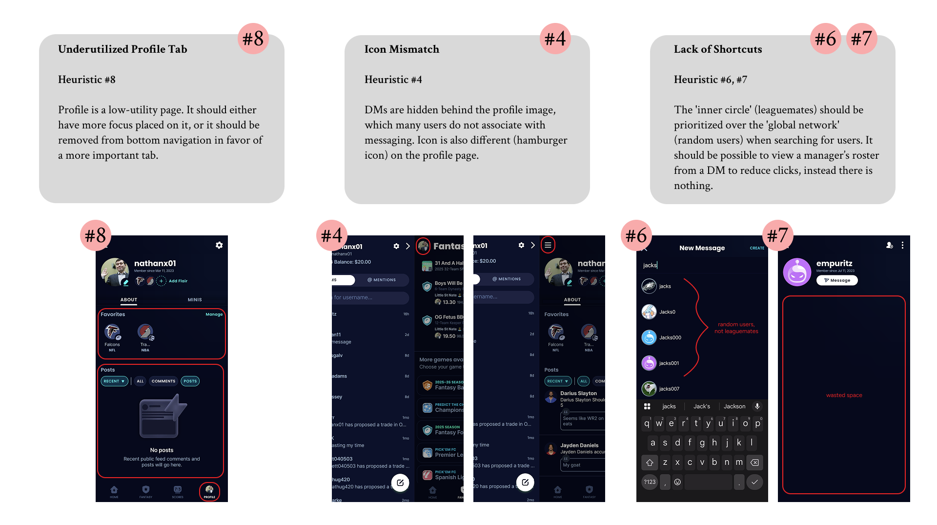
While not particularly relevant to messaging, I noted that the app also violated Heuristic #10 (Help & Documentation) by lacking any information within the app on how to disable the Picks tab. It seems that many users on Reddit were unaware that this feature could be turned off.
From a business perspective, this is likely intentional as the Picks tab promotes betting activity, which is a significant revenue driver for Sleeper. However, from a usability standpoint, it detracts from the user experience for those who do not wish to engage with gambling features.
4. Proto-Personas
Based on the data and analysis done in the previous steps, I developed three proto-personas to guide recruitment for testing.
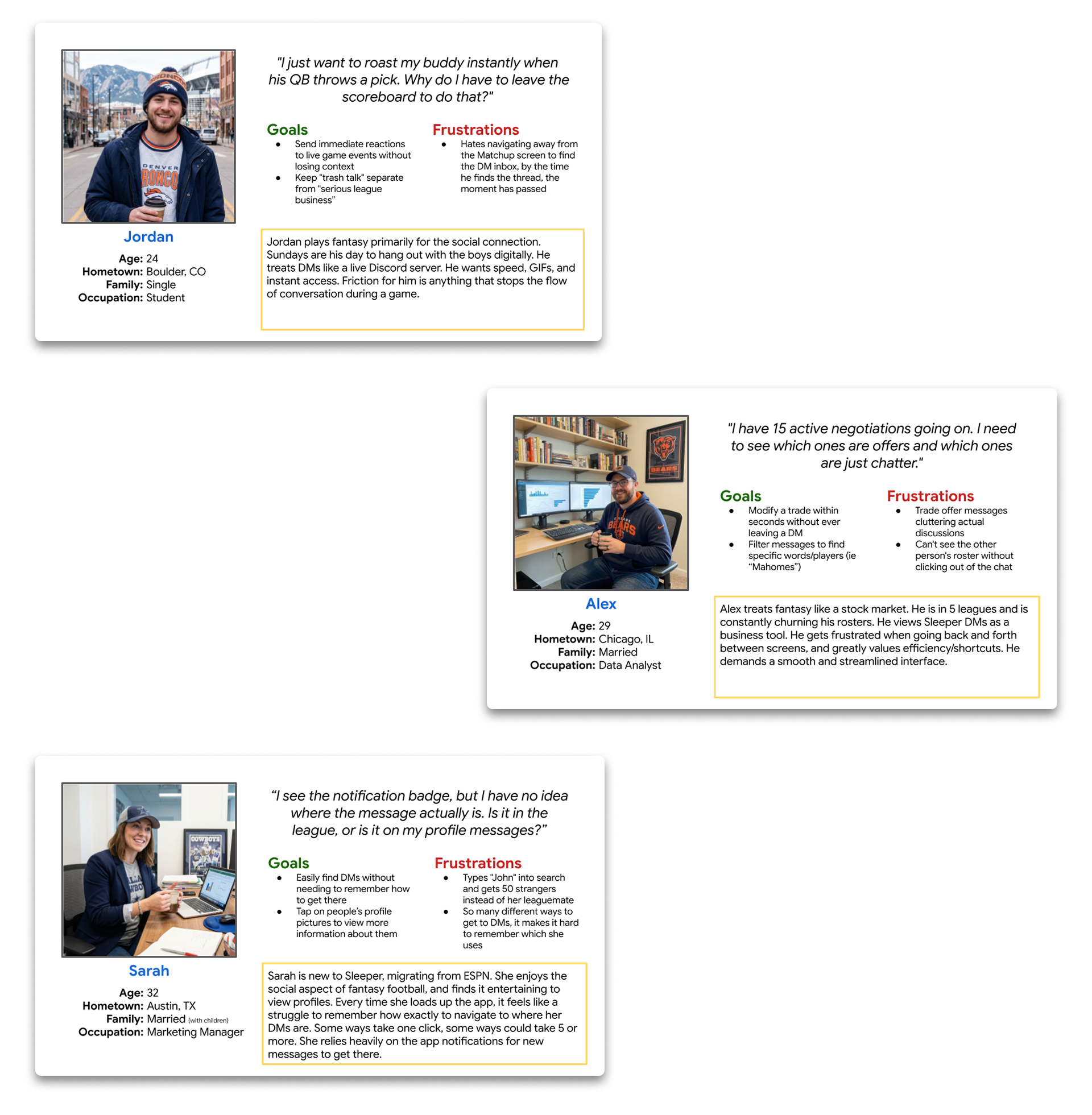
These personas helped ensure that I recruited a diverse set of users who represented different engagement levels and communication styles within Sleeper.
I tried to consider different needs of users that I know personally, as well as those expressed in Reddit comments. Testing will reveal which personas are accurate, most common, and relevant to the messaging experience.
With these insights, I formulated my core hypothesis to be tested in the next phase.
The Hypothesis
Sleeper's current navigation fragments the social experience, burying high-value interactions behind counter-intuitive paths. This creates measurable friction that inhibits the very interactions the platform was built to foster.
Phase 2: Initial Testing
To validate my findings, I designed a usability study focused on key tasks related to messaging and social interaction within the app. The study employed a mixed-methods approach, combining quantitative task completion metrics with qualitative user feedback.
After testing, I synthesized my findings using empathy mapping and journey mapping to identify pain points and opportunities for improvement.
Usability Testing
I recruited 7 participants in total that matched my proto-personas. Five participants were leaguemates of mine, while two were recruited via Reddit. All participants were active Sleeper users with varying degrees of familiarity with the app's messaging features.
Each session lasted approximately 30 minutes and included a series of three tasks designed to evaluate the messaging experience.
My leaguemates were tested in-person, while Reddit recruits were tested remotely via Zoom.
Participants were encouraged to think aloud as they navigated the app, providing insights into their thought processes and frustrations.
Here are the tasks I asked participants to complete:
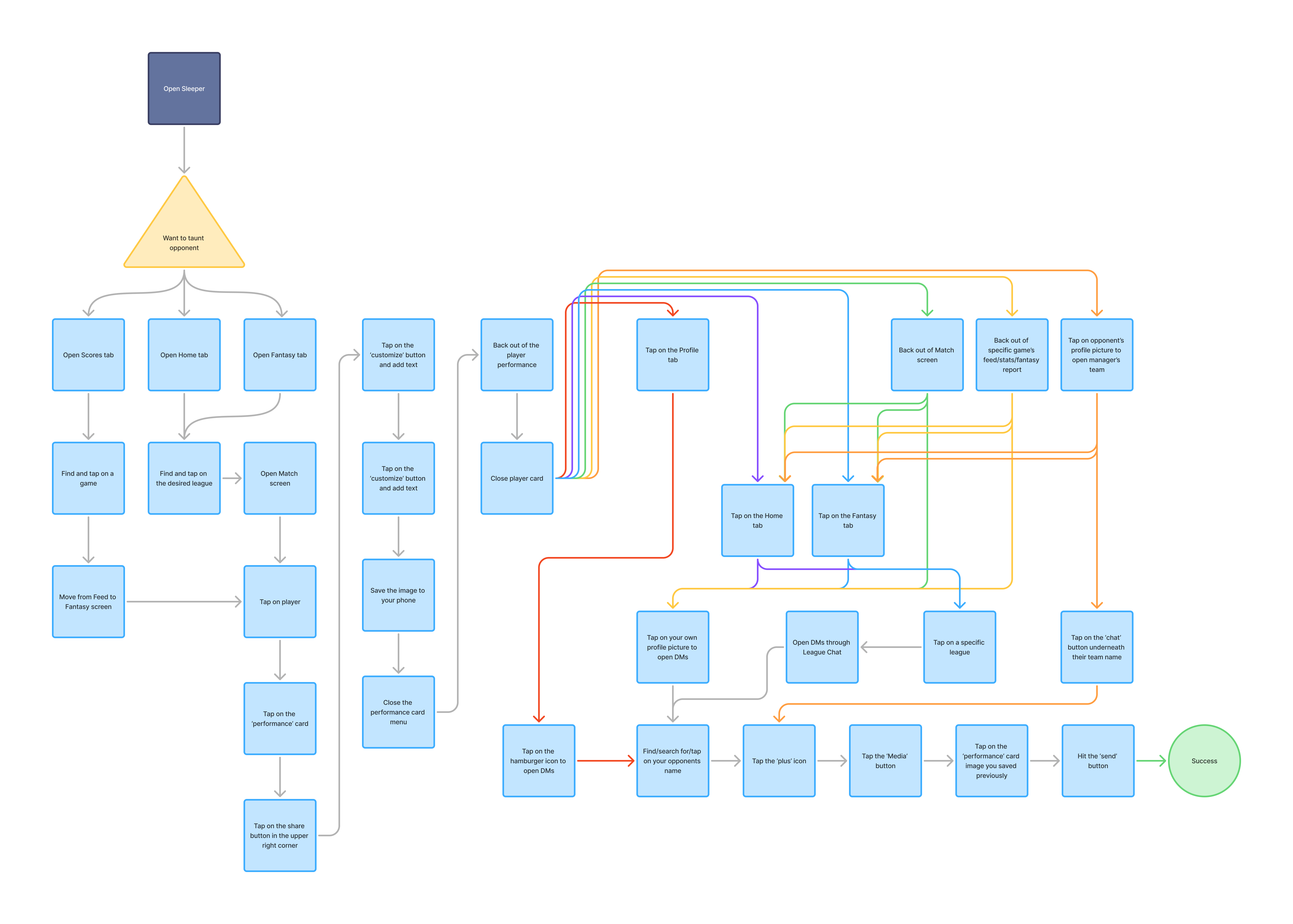
- Task 1: It's Week 13 and you want to taunt your opponent for starting Shedeur Sanders. Send your opponent Shedeur's Week 13 stat card, including a cheeky message.
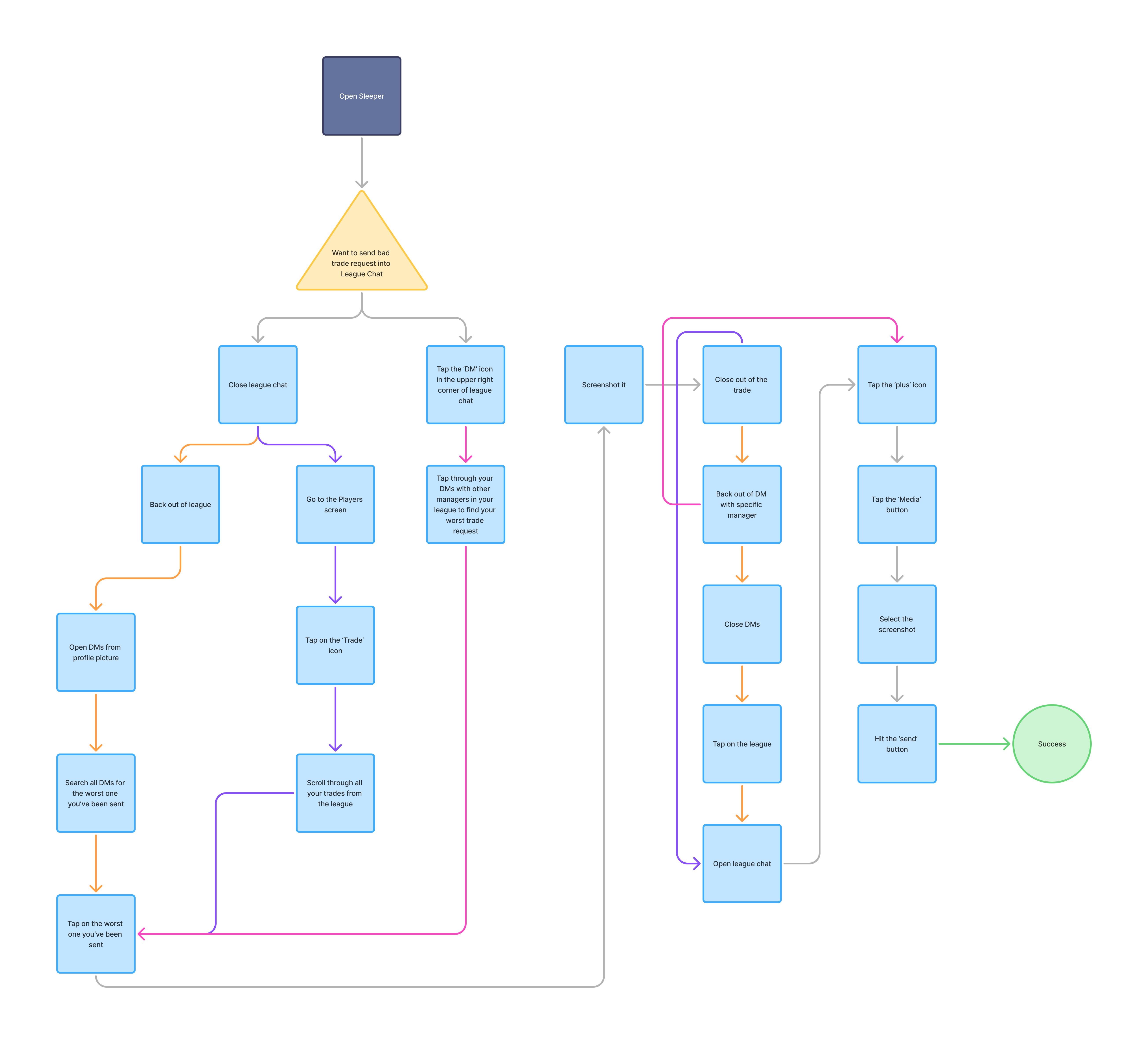
- Task 2: Everyone is discussing bad trades in league chat and you want to chime in. From league chat, find the worst trade request you've been sent this season.
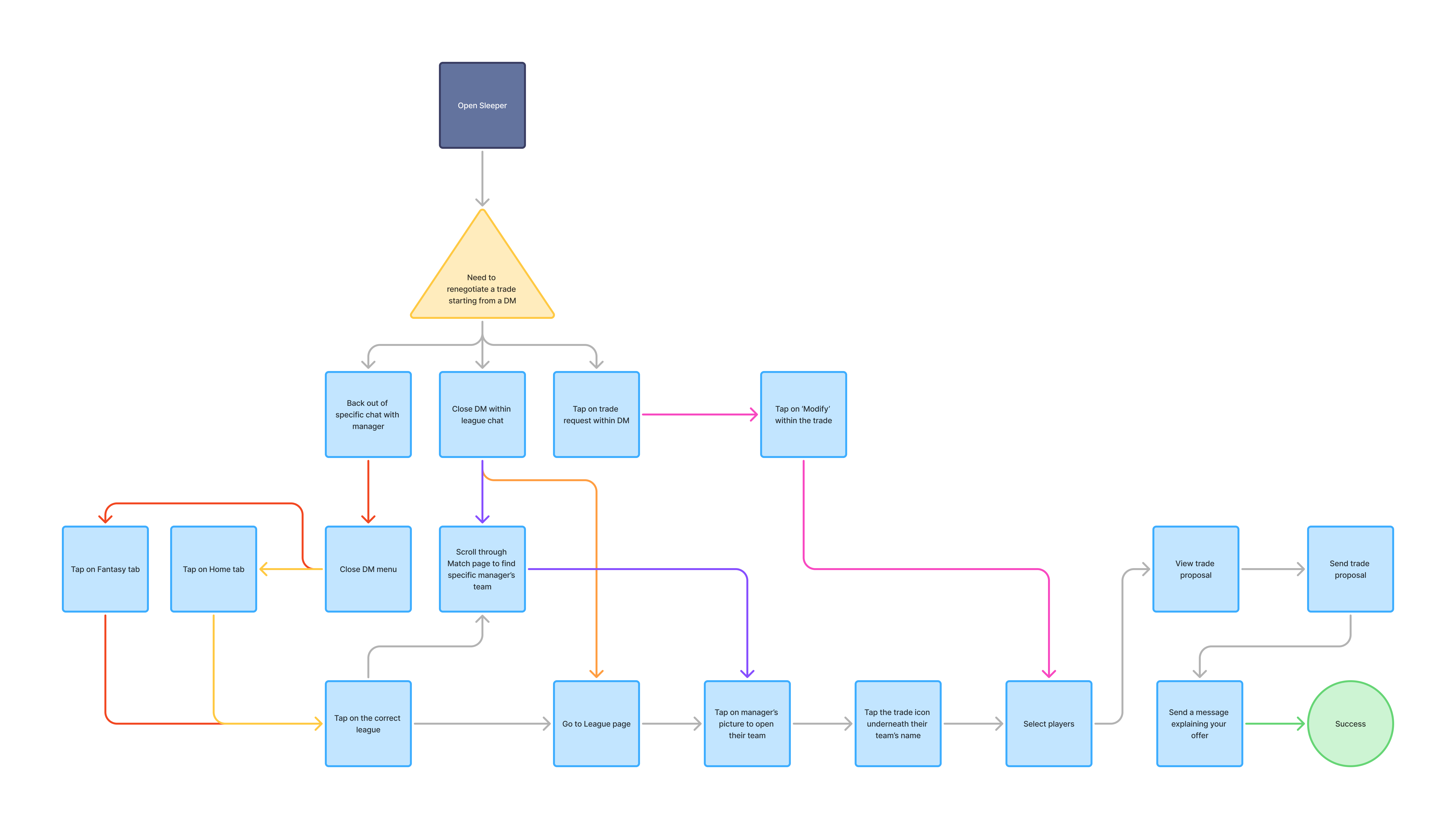
- Task 3: You've been negotiating a trade with me, but I'm not willing to give up the player you originally wanted. From our DM, send me a new trade request.
Task Flow Analysis
To visualize the interaction cost, I mapped the required click-path for each task. These flows highlight the excessive steps required to perform simple social actions.
Testing Results
Key metrics collected are as follows:
- Time on Task: Time taken to complete each task.
- User Satisfaction: Post-task satisfaction ratings on a scale of 1-5.
- Error Rate: Number of misclicks or incorrect actions taken during each task. I included switching between manager chats in Task 2 as an error since it indicates confusion.
The quantitative data revealed significant friction points:
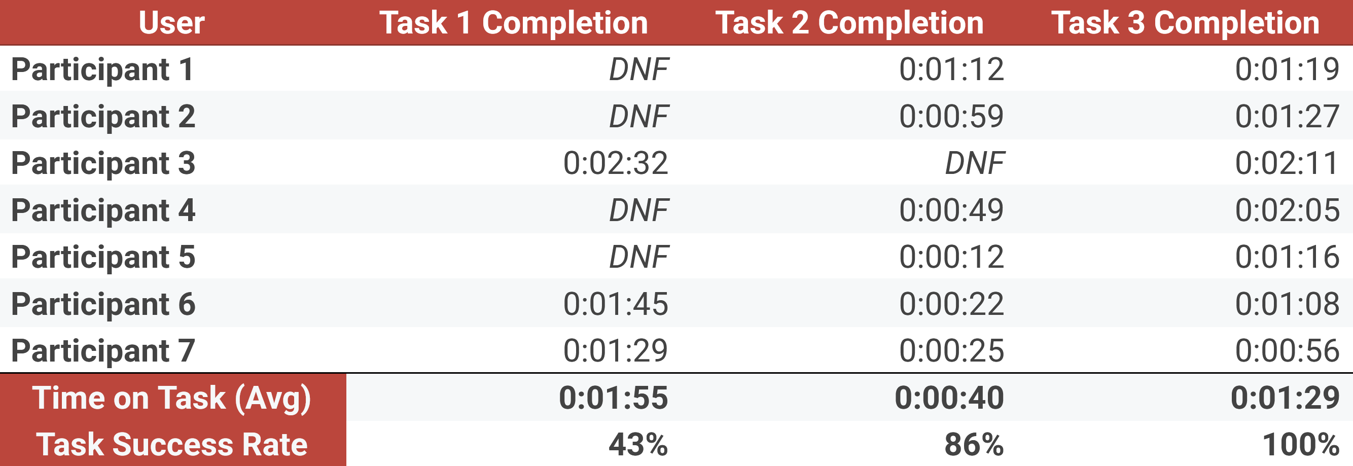
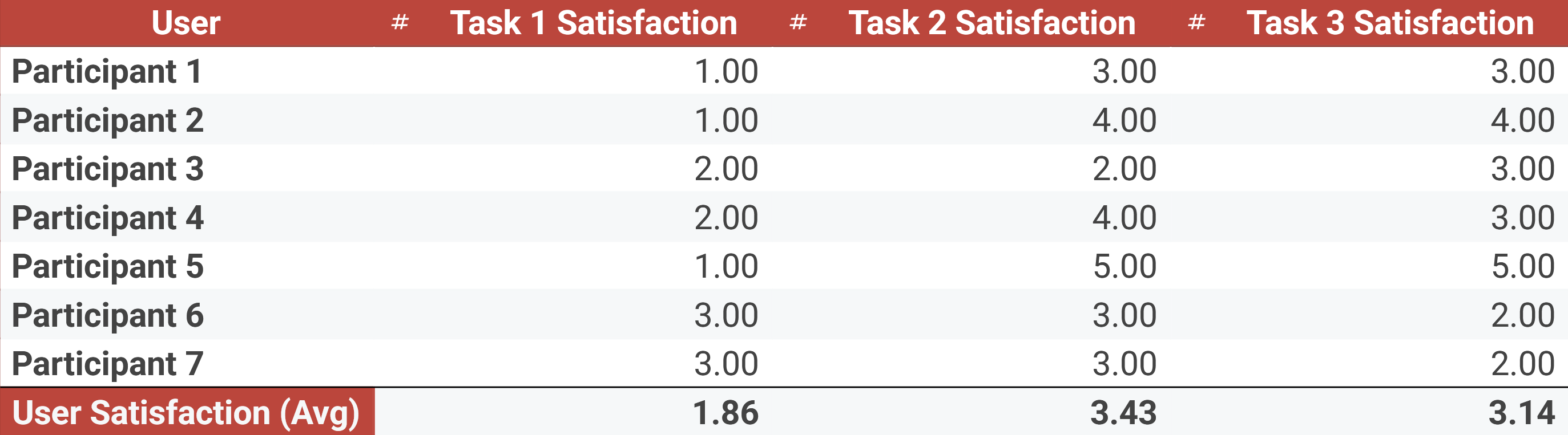
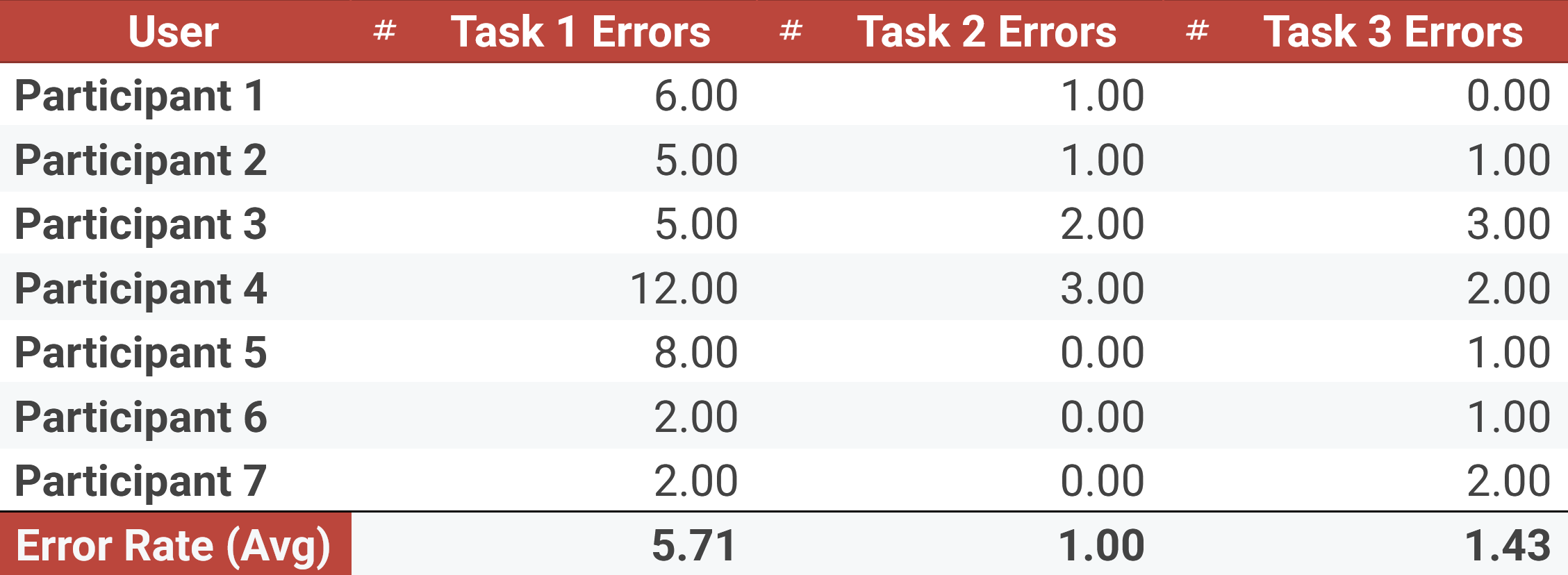
I was shocked at how many people didn't even know what I was talking about in Task 1.
Next time, I believe I could have picked better tasks (2 and 3 weren't as strong) for testing. However, I picked these tasks because I was curious about how users would choose to navigate the app.
For example, in Task 2, many users went through DMs instead of navigating to the 'Trades' tab. This revealed that users don't have a clear mental model of where to find certain features. Adding a 'search' function to chats would help users who choose this path find what they need faster.
In Task 3, I wanted to see if users would instinctively try to create a trade directly from the DM screen by tapping the other manager's name. Most users did, indicating that this is a natural expectation that the app fails to meet.
I also considered doing a sentiment score after each task, but with only 7 participants, I felt the qualitative feedback would be more valuable. I was already able to gauge sentiment from the satisfaction ratings and observed frustrations.
Overall, the quantitative data confirmed my hypothesis that the messaging architecture creates friction, but the qualitative data provided deeper insights into the specific pain points and user expectations.
Qualitative Synthesis
After each task, I asked participants a series of follow-up questions to gather qualitative feedback on their experience.
I determined that there was quite a bit of overlap in pain points between the Casual and the Social Butterfly personas, so I bundled their feedback into one empathy map.
The Power User had a few unique frustrations, so I created a separate empathy map for them.
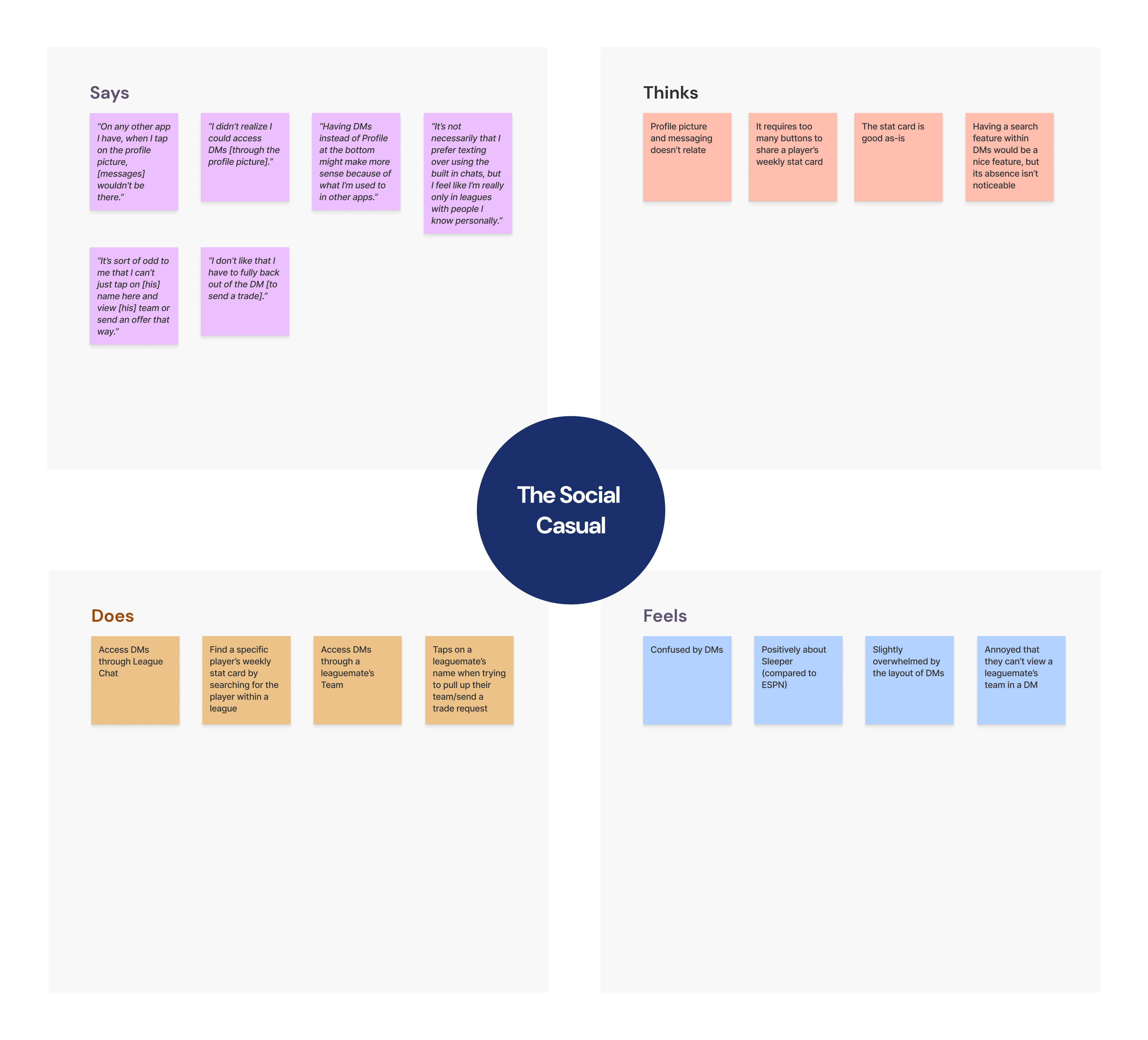
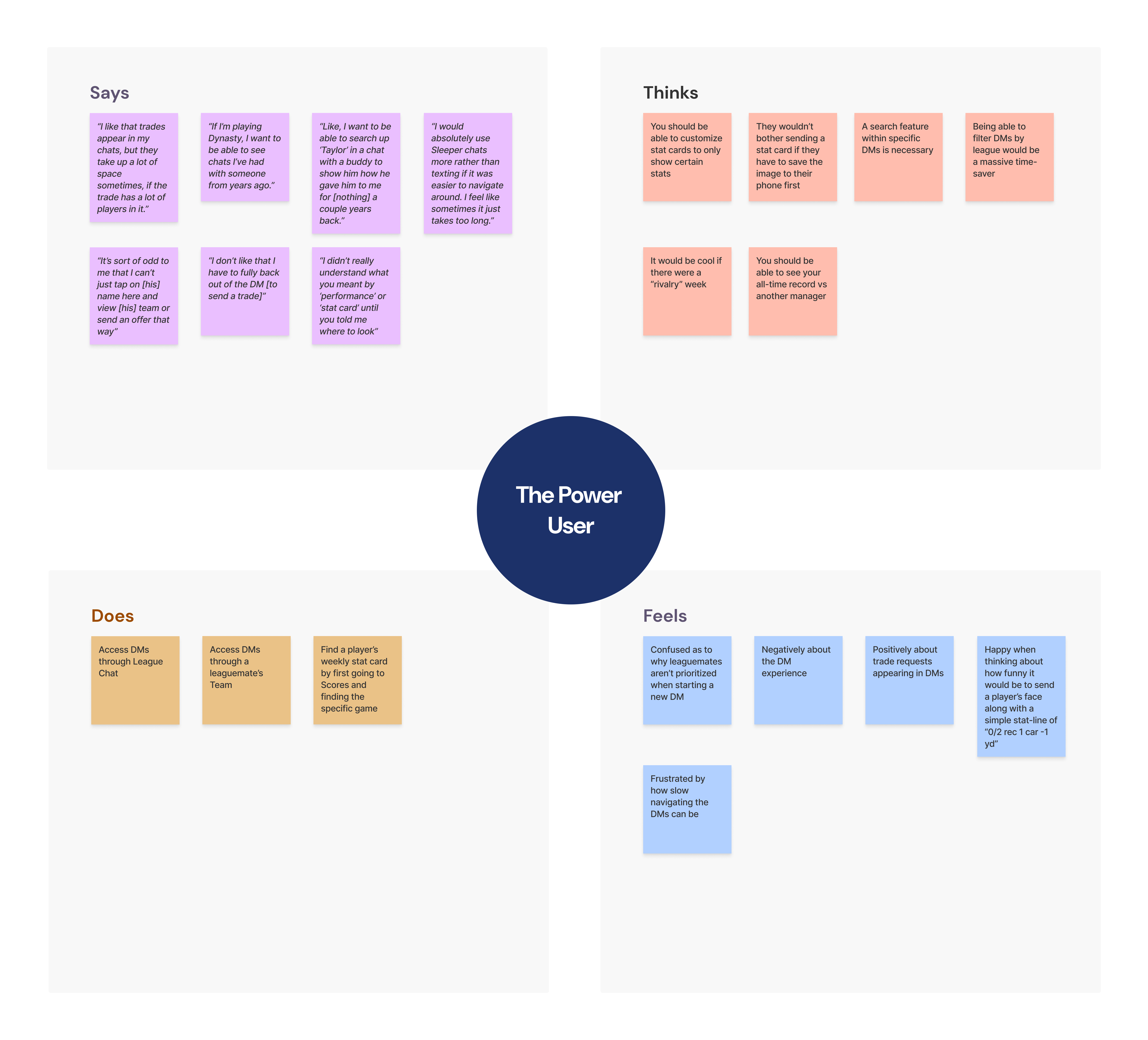
Despite their different usage patterns, both personas expressed frustration with the discoverability of messaging features and the cluttered interface. This lead to a decrease in overall satisfaction and engagement, as shown in the task metrics.
Journey mapping further highlighted specific pain points along the user flow. I chose to map the journey of the Social Casual persona as they attempted to complete Task 1 because it seemed that casual users struggled the most, but were the most interested in social features.
Phase 3: The Design Solution
Based on the research, I developed a set of high-fidelity mockups to address the core architectural flaws. The goal was not to reinvent the wheel, but to align the interface with the user's mental model of a "Social-First" app.
1. The Messaging Hub
To solve the navigation identity crisis, I elevated "Chats" to the bottom navigation, replacing the low-utility Profile tab.
Crucially, I separated "League Chats" from "Direct Messages" to reduce cognitive load and the risk of taps occasionally not registering.
I also standardized the top navigation (Hamburger + Settings) across all screens for heuristic consistency, while retaining quick access to profile customization (flair/avatar) directly within the DM view.
2. Signal-Over-Noise Filtering
Research showed users struggled to find relevant people. I redesigned the "New Chat" search logic to prioritize Mutual Leaguemates over global users.
I also introduced granular filters to the inbox, allowing users to instantly view only "Active Trades" or hide inactive threads, directly addressing the "buried trade offer" friction point.
3. The Social Card
I transformed the generic User Profile into a context-aware "Relationship Card." Now, when viewing another user, the primary actions dynamically change based on context: if you share a league, you see "Taunt" and "Trade" buttons.
I also surfaced "Shared Leagues" and H2H history to gamify the relationship and drive engagement.
Reflection
I didn't iterate on the designs of pages such as "Taunt" or "League Chat" as I felt the core architectural changes were more important to validate first. I believe real analytical data that Sleeper posess will provide a clearer direction for future design iterations.
I also didn't conduct a second round of usability testing on the new designs due to time constraints. However, I would recommend doing so to validate that the proposed changes effectively reduce friction and enhance the social experience.
Next Steps
Sleeper's competitive advantage is its social layer. However, the current architecture creates friction that actively inhibits social interaction.
By weaving communication into the core gameplay loop, Sleeper can reduce the cognitive load of socializing.
My recommendation to Sleeper is to A/B test these changes in the next beta release to measure its impact on Daily Active Users and message volume.
Check analytics, see how many users engage with the new messaging features, and gather feedback through in-app surveys to iterate further.
Check your subreddit for user feedback post-launch to see if sentiment has improved.
Research is never truly done, and continuous iteration based on user feedback is key to maintaining a user-centric product.
This would be my plan if I were to hand off this research to the Sleeper product team.